Transforming a commercial janitorial company into a bold, credible brand built to compete for high-value work.
CLIENT
Phenix Janitorial
role
Brand & digital creative lead
industry
Commercial & industrial services
scope
Logo evolution · Website · SEO · Pitch deck · Marketing collateral
THE OPPORTUNITY
A capable company
needed a presence
as distinctive as its
reputation.
Brandi came to me through a trusted referral for a logo refresh and a new website. Her commercial janitorial business had the experience and project history to compete for significant work, but the category around her was filled with generic websites and interchangeable visual language.
The challenge was to make Phenix immediately recognizable while communicating the precision, safety and reliability expected by commercial and industrial decision-makers. The experience also needed to showcase large-scale work, support Google visibility and give Brandi a stronger tool for winning new business.
THE STRATEGIC IDEA
Rise above
the expected.
Distinctive by Design
Black, white and electric magenta created immediate separation from the predictable blue-and-green visual language of the category.
Proof over Promises
Project imagery, capabilities and operational standards made the company’s experience visible instead of relying on generic service claims.
Built to Sell
Every touchpoint was designed to support a real business conversation—from discovery on Google to a customized client presentation.
IDENTITY EVOLUTION
Recognizable at its core.
Stronger in every use.
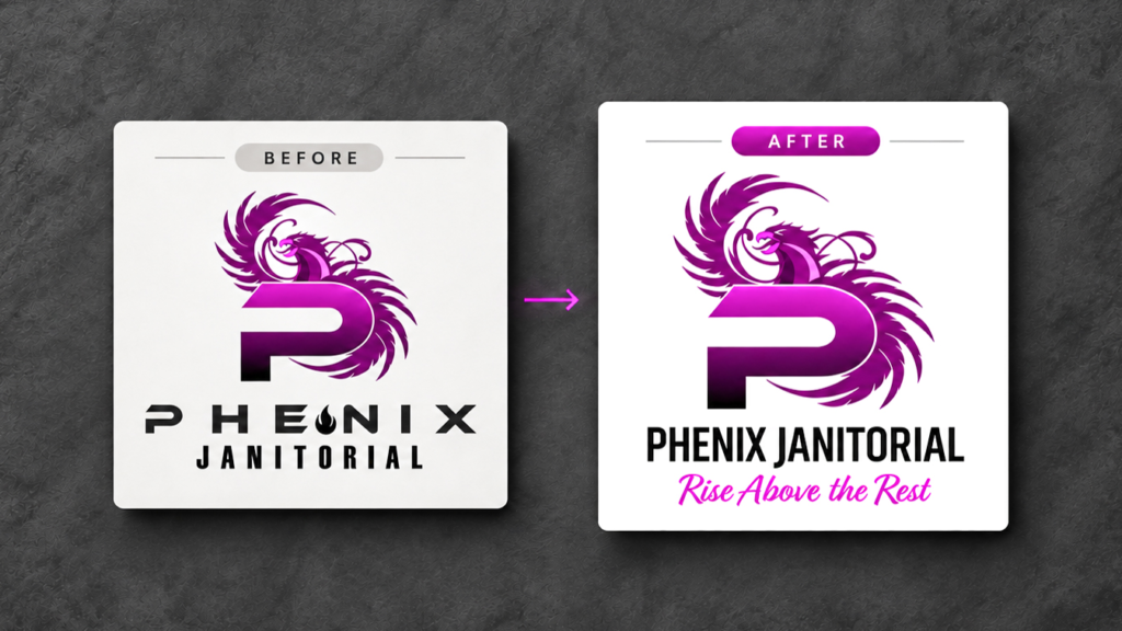
The existing phoenix-and-P concept had equity worth preserving. Rather than replace it, I refined the system around it—cleaning up the supporting typography, improving hierarchy and introducing type choices that better reflected the commercial service industry.
The refresh retained the personality Brandi valued while making the identity easier to read, reproduce and extend across sales, digital and environmental applications.
DIGITAL EXPERIENCE
A website
designed to
be found &
remembered.
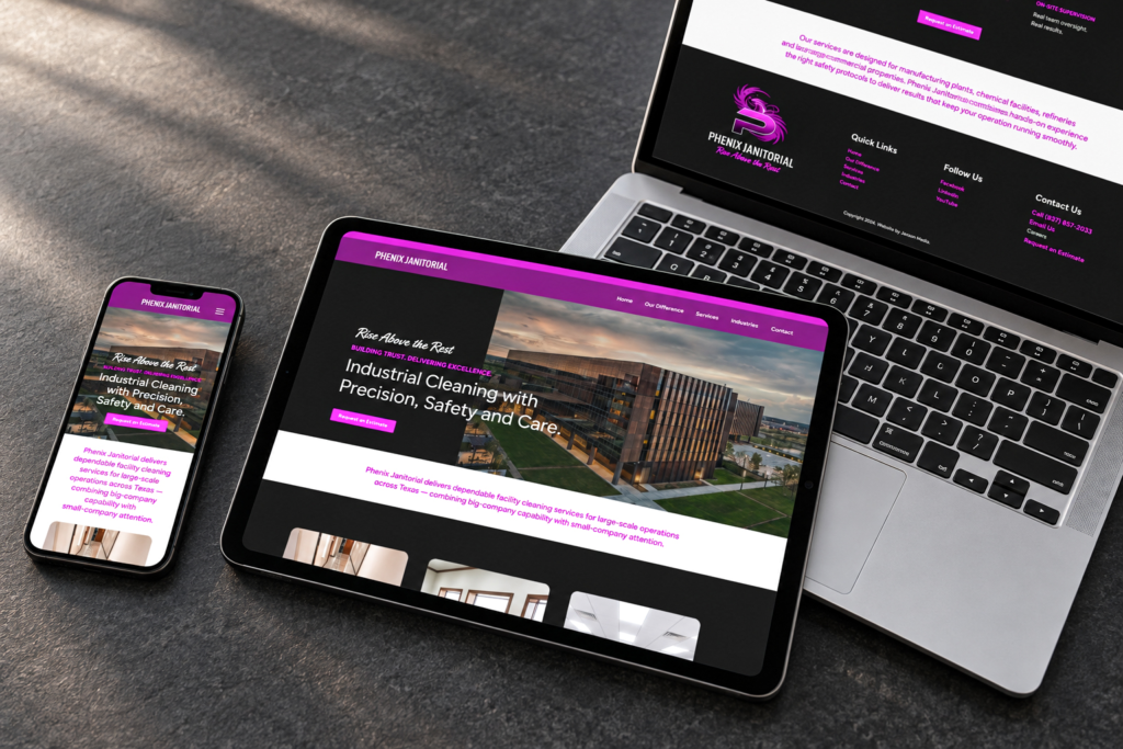
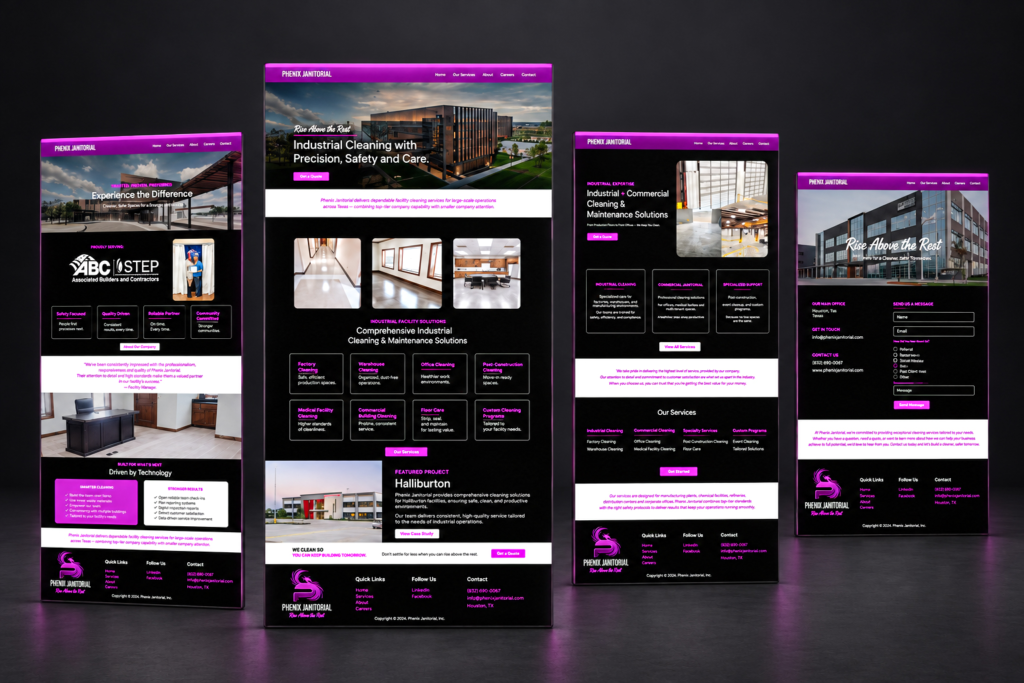
The site rejects the category’s generic template aesthetic in favor of a confident, high contrast experience that makes Phenix feel established and capable from the first screen.
Clear service architecture, location and capability language, project proof and SEO-informed content give search engines stronger context while helping prospective clients quickly understand what Phenix can handle. Responsive layouts carry that clarity across desktop, tablet and mobile.
FROM FIRST IMPRESSION TO DEEPER PROOF
A complete digital path
for clients, talent and growth.
The expanded page system supports service discovery, competitive differentiation, employment needs and direct inquiry—allowing the website to work as both a credibility platform and an active business-development tool.
ADAPTABLE SALES PRESENTATION
A pitch deck that
changes for the
client, not the brand.
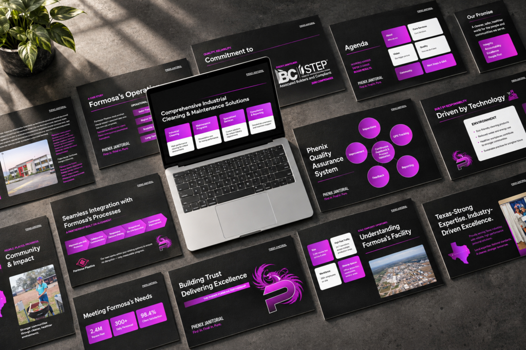
The template extends the website’s direct language and modular structure into the meeting itself, helping Phenix move from a memorable first impression to a more confident sales conversation.
Brandi needed a presentation she could customize for each prospective client without rebuilding the story from scratch. I created a flexible deck system that gives her room to tailor project needs, facility details, processes and proof while maintaining a polished, consistent visual standard.
INTEGRATED BRAND ROLLOUT
One bold
system,
carried into
the world.
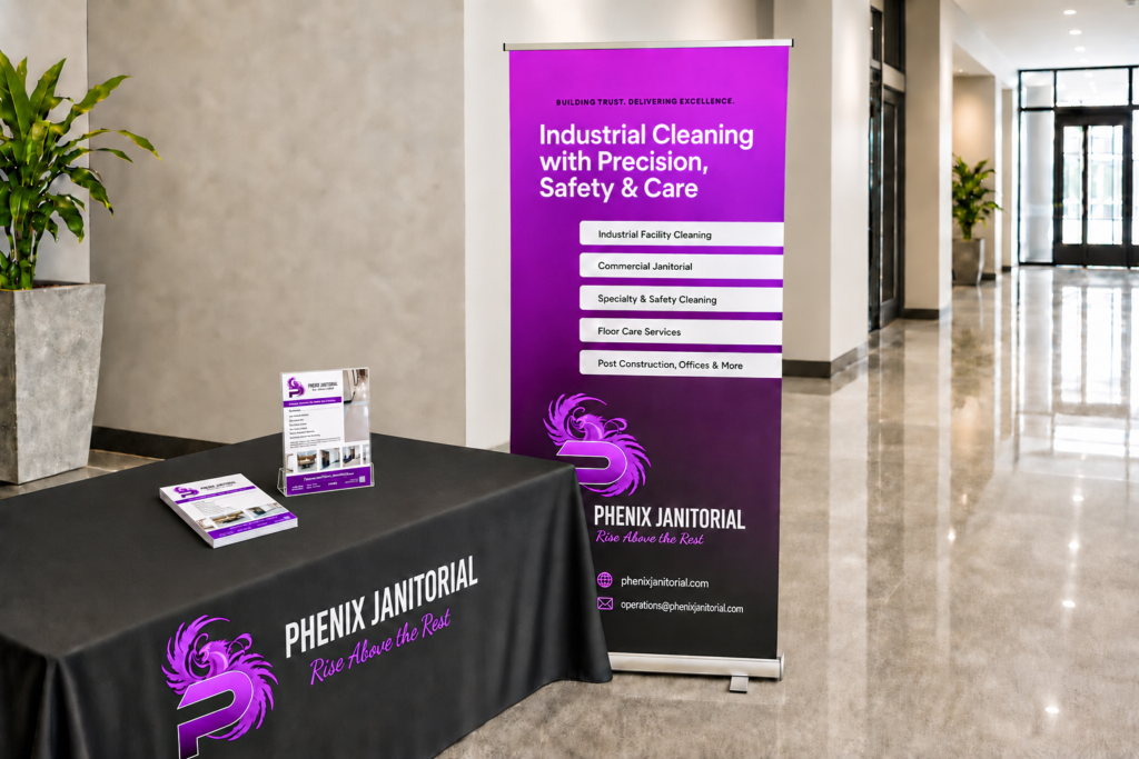
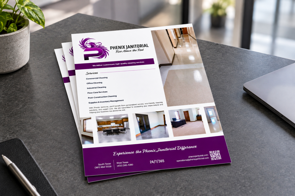
Once the refreshed identity was established, Brandi expanded it across business cards, flyers, social media and event materials. The consistent black-and-magenta language gives the company a recognizable presence whether it appears in a client’s inbox, at a vendor event or in a printed leave-behind.
OUTCOME
A stronger brand
and a creative
partnership that
kept expanding.
Phenix now has a cohesive system connecting identity, search- conscious website content, sales presentations and day-to-day marketing. The work gives Brandi stronger tools to communicate the scale of her experience and present the business consistently across every stage of a client relationship.
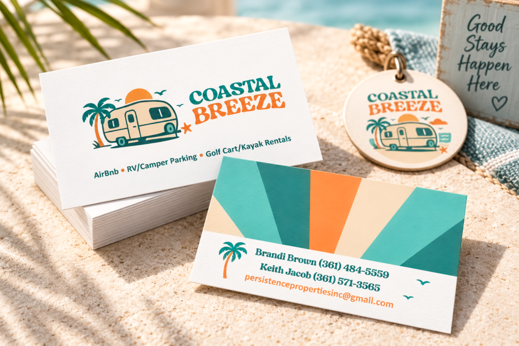
Just as important, the project established an ongoing partnership built on trust, polished execution and clear communication. Brandi has since asked me to create distinct identities and marketing materials for two additional ventures: Coastal Breeze and MidCoast Ranch & Tire.
TRUST THAT TRAVELED TO NEW VENTURES
Different audiences.
The same creative
partnership.
The relationship expanded because each new business could receive its own point of view without losing the strategic thinking and dependable process behind the work.
HOSPITALITY & RECREATION
Coastal Breeze
A modern coastal-hippie identity for an Airstream stay, RV parking and outdoor rentals—warm, playful and intentionally distinct from the Phenix brand.
RANCH, TIRE & TRACK SERVICES
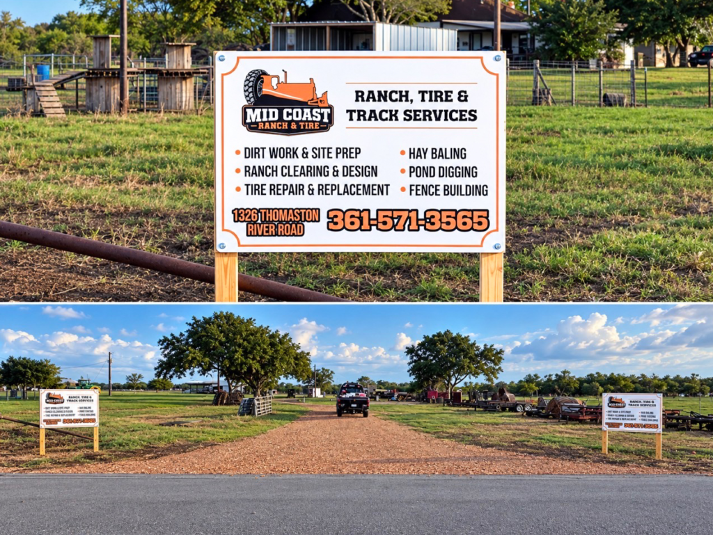
MidCoast Ranch & Tire
A rugged service brand developed from the family’s original cattle mark and carried into business cards, signage and social campaigns.
"My experience with Jeanine has been phenomenal. She has helped me do
a complete website build, revamped my logo, created marketing campaigns,
and even vendor decks for client presentations. Her prices are a great value
for the amount of work and consideration that she places into each project.
I would recommend her over and over again."
Brandi Brown CEO, Phenix Janitorial
WHAT THIS PROJECT DEMONSTRATES
Brand evolution connected
directly to business development.
Phenix Janitorial demonstrates my ability to preserve useful brand equity while strengthening the system around it—then connect identity, SEO informed content, digital experience, sales enablement and ongoing marketing into one practical platform for growth.