Building a premium hydration brand for athletes who expect sustained energy, mental clarity and performance without compromise.
CLIENT
Full Swing Hydration
role
Brand & marketing creative lead
industry
Performance hydration
scope
Strategy · Identity · Packaging direction · Launch marketing
THE OPPORTUNITY
Performance
hydration without
the predictable
performance aesthetic.
Full Swing Hydration was entering a competitive electrolyte category with a focused audience: golfers, athletes and performance driven consumers who need hydration, energy and concentration to work together.
The client wanted a brand that felt sleek, memorable and high-end—equally at home in a golf bag, a premium retail environment or a professional setting. The challenge was to communicate athletic credibility without becoming loud, overly technical or interchangeable with traditional sports supplements.
THE STRATEGIC IDEA
Back nine energy.
Boardroom focus.
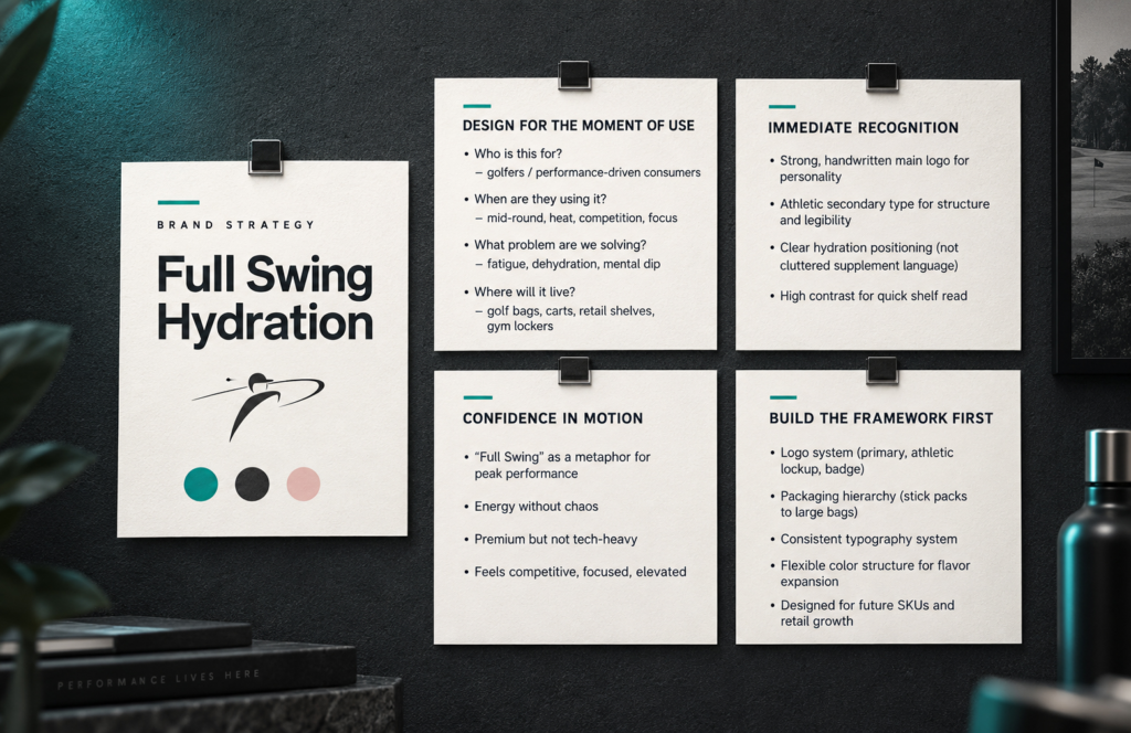
Designed for the moment of use
The system began with the realities of the customer: heat, competition, fatigue and the need to remain mentally sharp through the final hole—and beyond it.
Confidence in motion
“Full Swing” became more than a golf reference. It expressed peak performance, controlled energy and the confidence of feeling fully dialed in.
Built to expand
A flexible identity, packaging hierarchy and flavor- color structure created room for future products, environments and campaigns without losing recognition.
IDENTITY SYSTEM
Human energy.
Athletic structure.
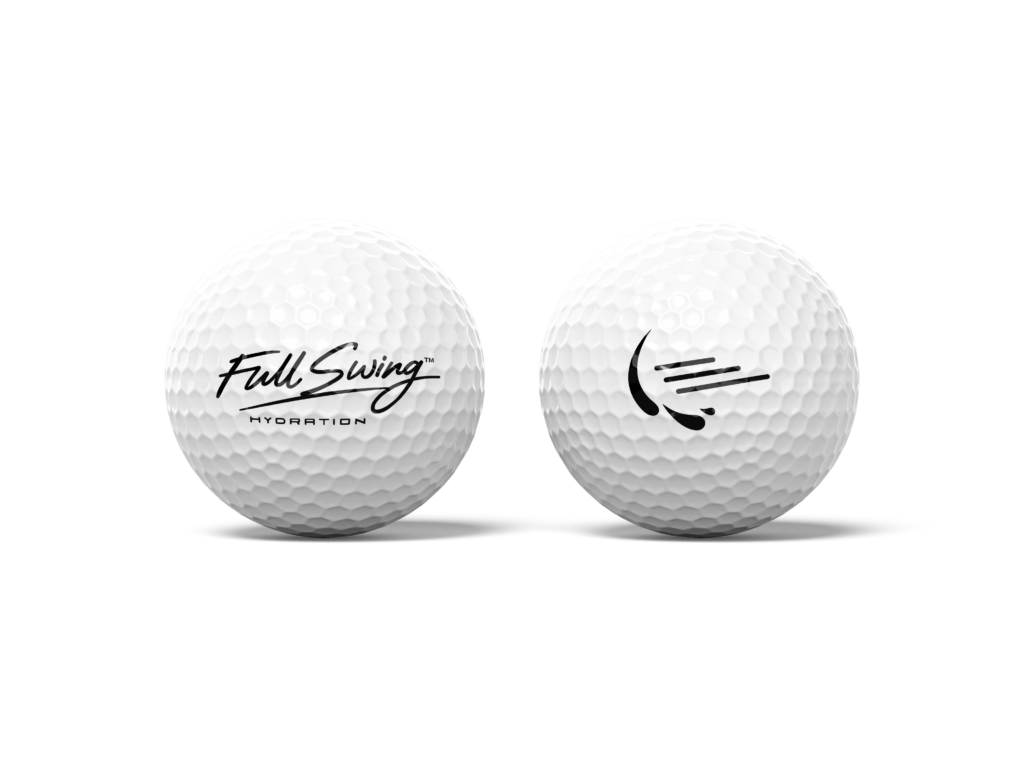
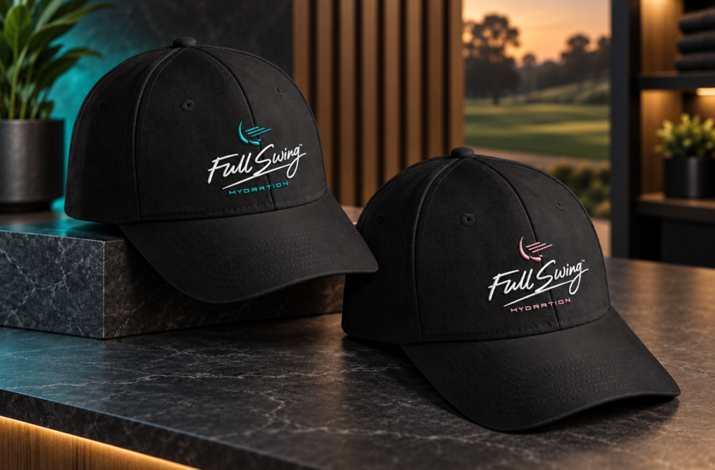
The identity balances personality with precision. A confident handwritten word mark brings human momentum, while the structured secondary typography adds an athletic, performance -driven rhythm.
The abstract mark combines the visual movement of a golf swing with fluid forms that suggest hydration. Together, the elements create immediate recognition without depending on literal sports imagery.
A SYSTEM, NOT A SINGLE MARK
Consistency
designed in
from the
beginning.
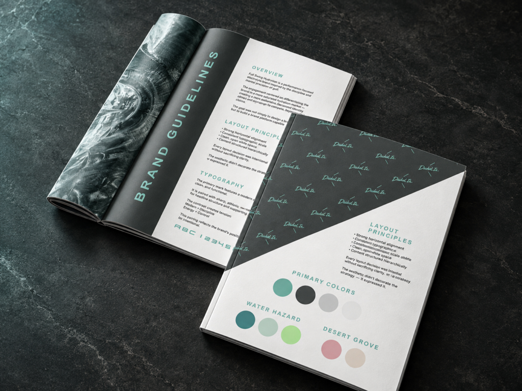
The guidelines established the visual logic behind the brand: typography, spacing, imagery, color behavior and hierarchy. Teal anchors the core identity, while adaptable flavor palettes allow individual products to feel distinct without fragmenting the system.
PACKAGING DIRECTION
From creative
vision to
production reality.
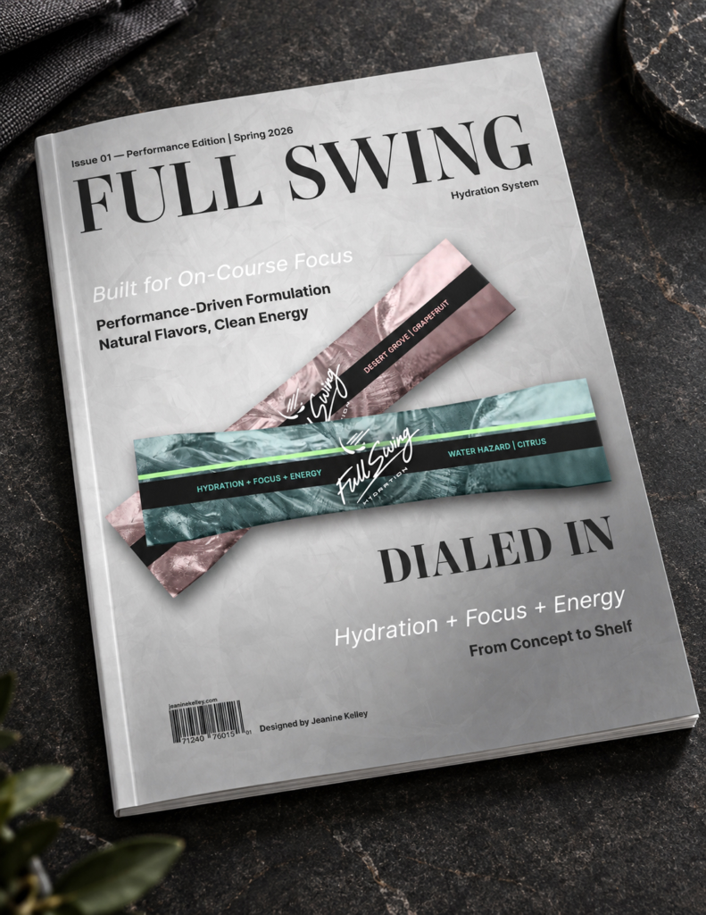
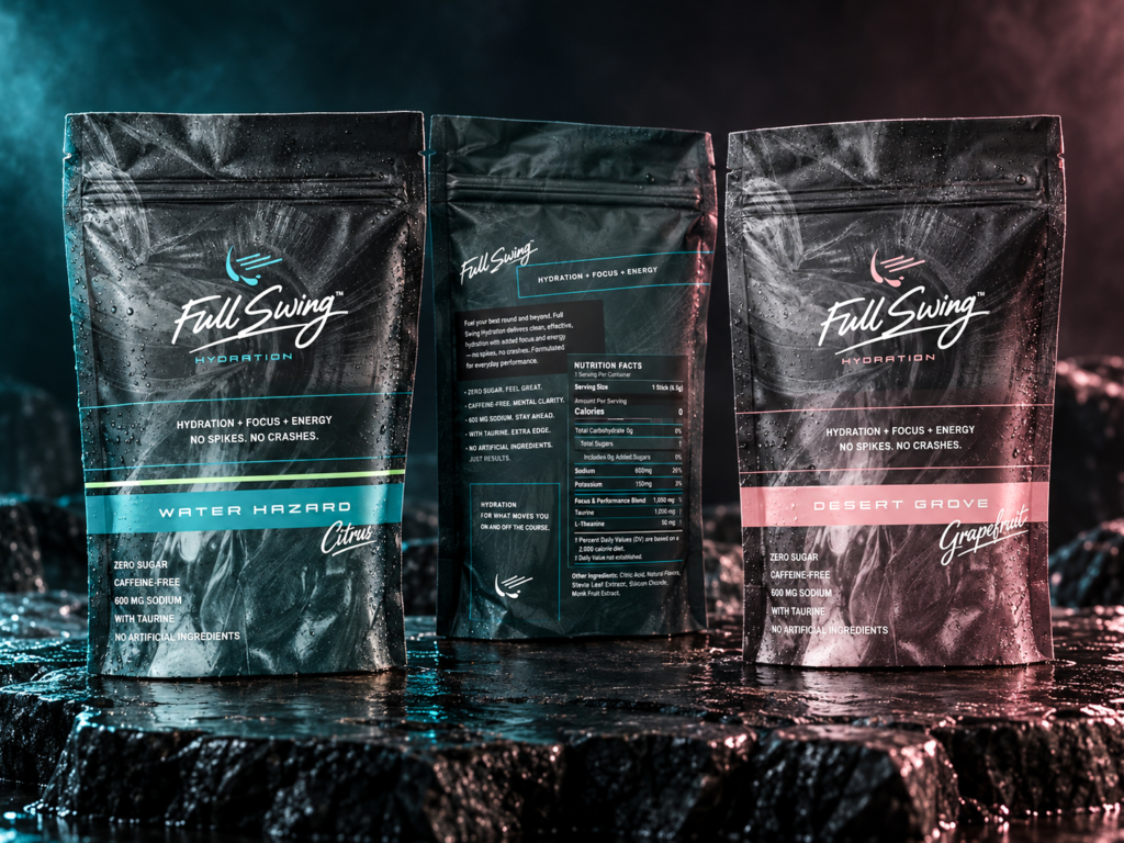
After developing the brand and initial packaging direction, I coordinated directly with the packaging manufacturer to guide the final production design. This required translating the visual system into practical packaging requirements while protecting hierarchy, recognition and the premium character of the brand.
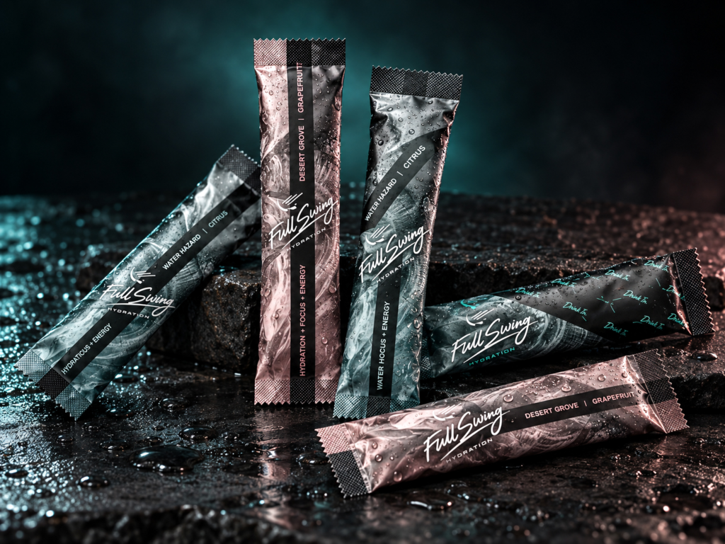
The final system carries consistently from full-size pouches to individual stick packs, using high contrast for fast recognition and flavor specific color to support an expanding product family.
BRAND ACTIVATION
A visual language
ready to leave
the package.
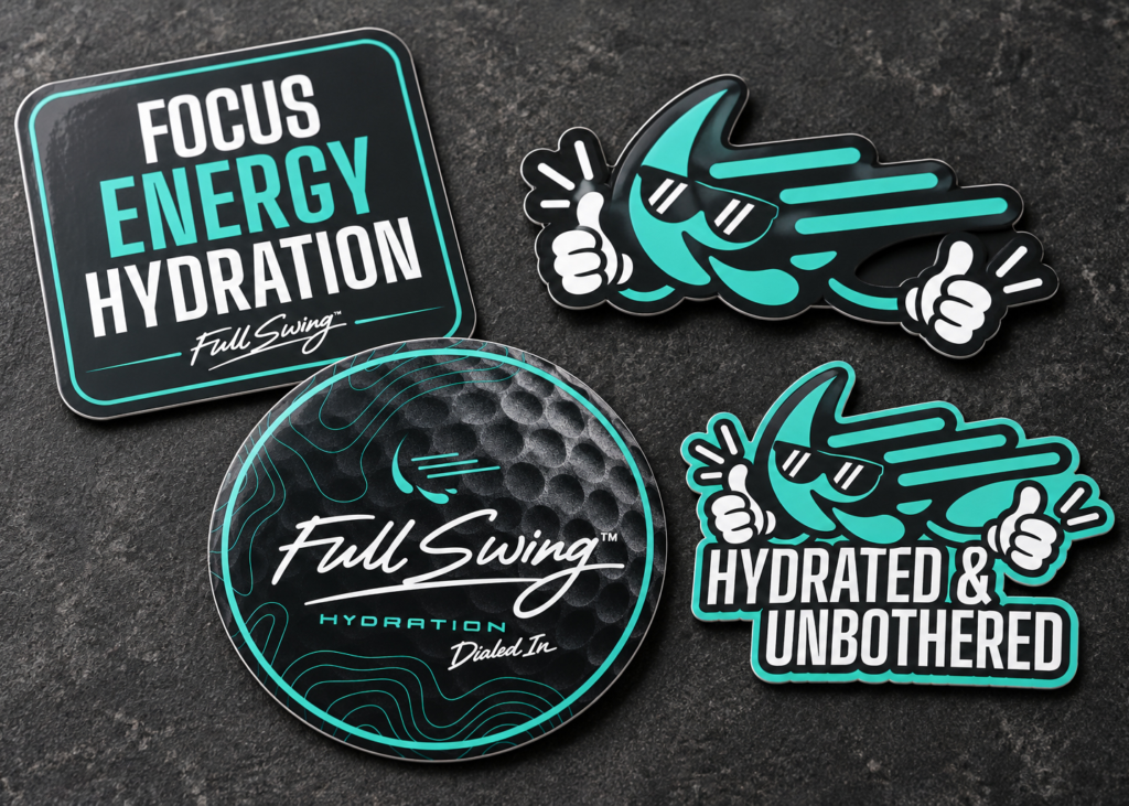
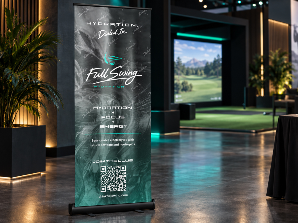
The identity expanded into promotional, event and lifestyle applications that meet the audience where the product belongs: on the course, at launch events and inside the routines of performance-minded customers.
OUTCOME
A launched brand
and a relationship
that continued
to grow.
Full Swing Hydration has launched with a cohesive identity spanning packaging, promotional materials, event presence and brand communications. I continue to work directly with the founder to ensure new promotional needs are executed consistently as the company grows.
The strength of the work also led to an expanded relationship: the client invited me to serve as a contract creative director on additional initiatives, extending my role from original brand development into ongoing creative leadership.
"I recently decided to start my own brand. I had a vision, but needed it
brought to life. Jeanine did just that. She communicated well and delivered
all the assets needed in a timely manner. If you need anything from a logo
to a full brand identity package, I highly recommend working with Jeanine."
Bruno Paolina CEO, Full Swing Hydration
WHAT THIS PROJECT DEMONSTRATES
Strategic vision carried
through execution.
Full Swing Hydration demonstrates my ability to take an early-stage product from positioning and identity through packaging coordination, launch applications and ongoing brand stewardship connecting the big idea to the details that allow it to perform in the real world.