A clearer menu
became the beginning
of a more memorable
restaurant experience.
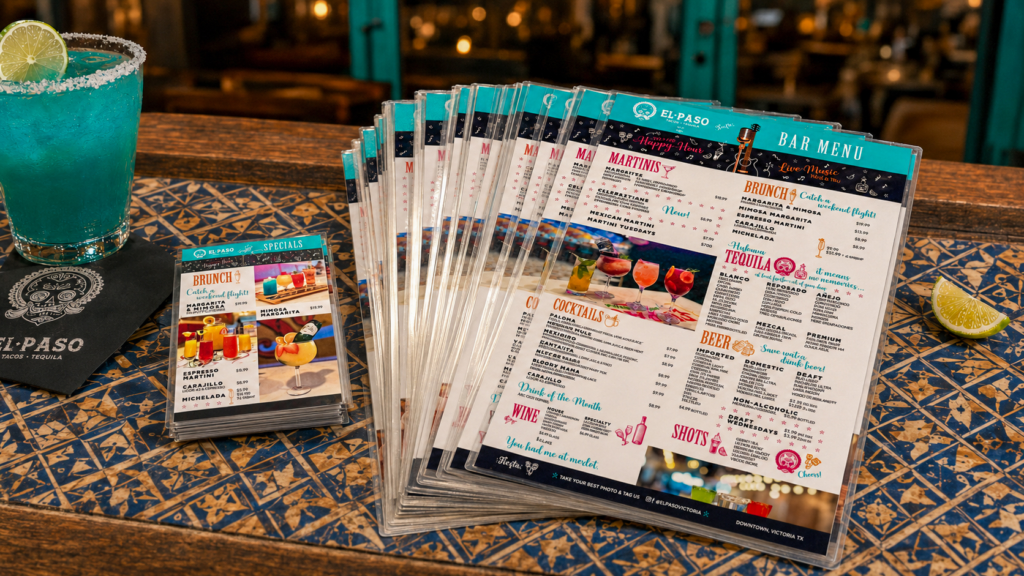
I began working closely with the restaurant manager on a redesigned menu featuring updated photography that I shot on location. The goal was practical—make a dense selection easier to navigate but the experience still needed to feel colorful, energetic and unmistakably El Paso.
The two-sided menus were paired with smaller tabletop specials, creating the first pieces of a flexible system that could organize a large amount of information without flattening the personality of the restaurant.
THE STRATEGIC IDEA
Make every surface
part of the experience.
Clarity first
Strong hierarchy and purposeful grouping kept extensive food, drink and pricing information quick to scan.
Playful Repetition
Recurring type, illustration and color cues made each new message feel fresh without becoming disconnected.
Designed to Change
Modular compositions supported weekly offers, weekends and special events while preserving recognition.
MENU SYSTEM & ORIGINAL PHOTOGRAPHY
Appetite,
information
and personality
held in balance.
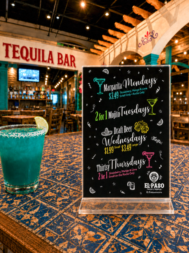
The smaller tabletop pieces pulled featured offers out of the primary menu, making seasonal and weekly promotions easier to notice and easier for the restaurant to update.
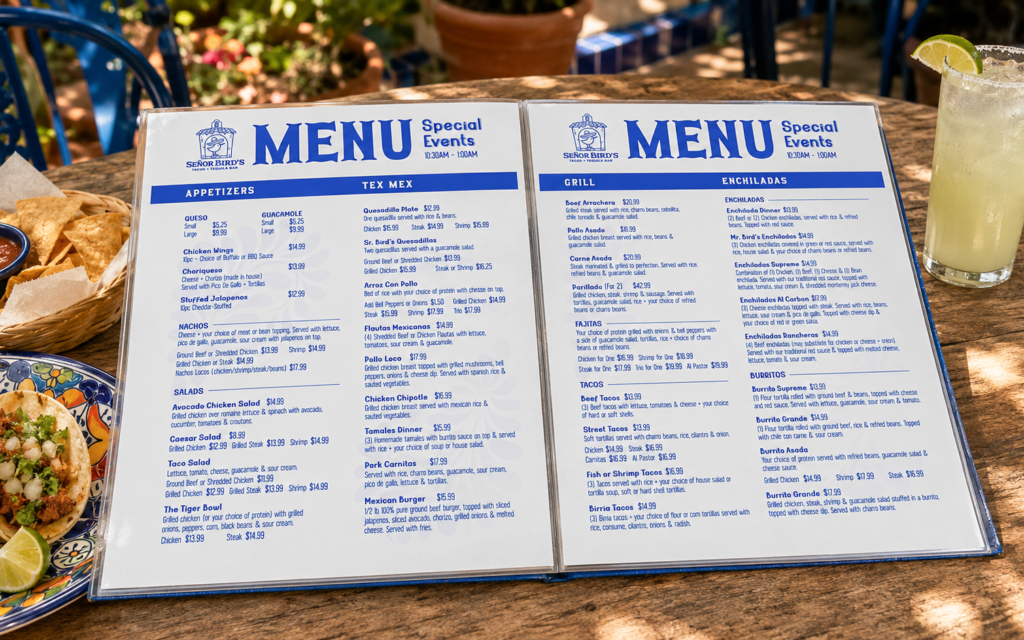
I photographed updated drinks and menu items, then used the images as anchors inside a highly structured layout. Color-coded sections, clear price alignment and a repeatable visual vocabulary made the full bar menu easier to read while giving guests more moments to discover.
RESTAURANT-WIDE CAMPAIGN
Built to change
without losing
recognition.
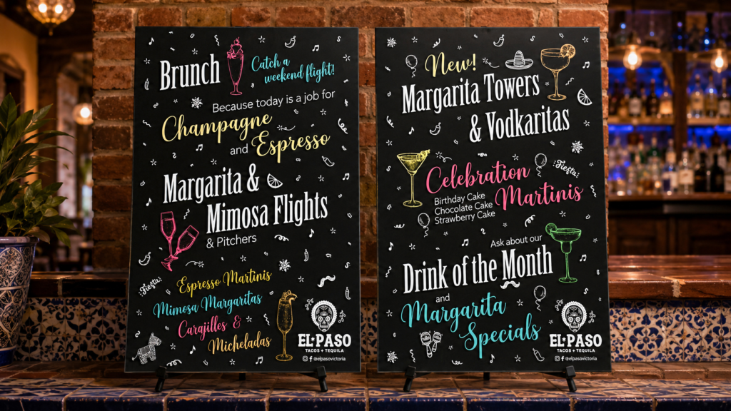
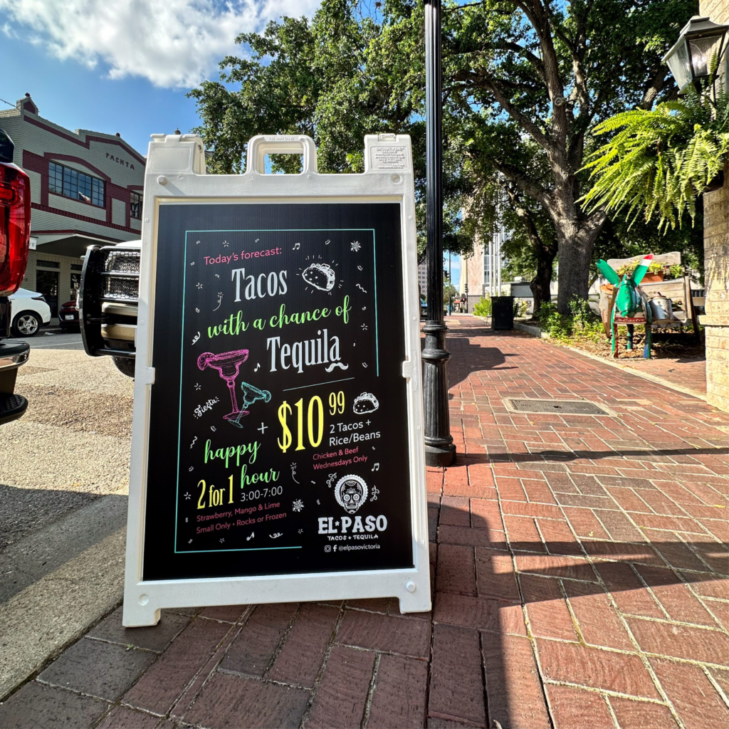
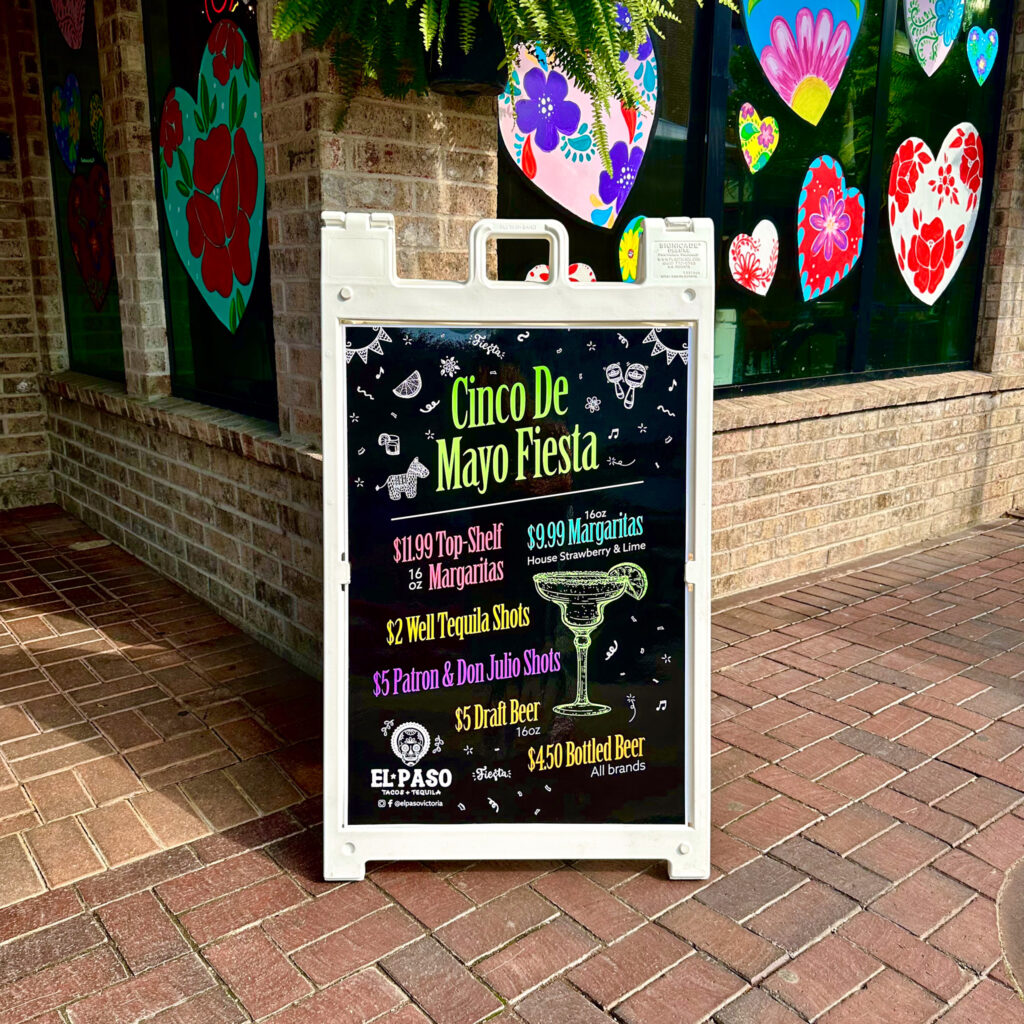
The menu language expanded into a series of wall posters, bathroom graphics and changeable sidewalk signs. Popular sayings and hand drawn details created moments of entertainment, while enlarged weekly offers gave regular guests a reason to notice something new—and return.
CREATIVE CONTROL
Fun enough to
reward attention.
Structured enough
to stay useful.
The welcomed challenge was to create energy without visual chaos. A dark chalkboard foundation gave the system consistency; a disciplined accent palette created variety; and repeatable typography and doodle motifs helped every piece belong.
That framework let the content become playful while the hierarchy continued doing the practical work—guiding the eye, communicating an offer and making the restaurant feel more considered.
A SECOND AUDIENCE
A brand
experience
designed for the
whole table.
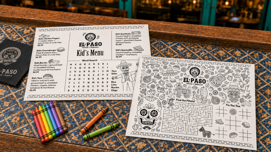
The campaign later expanded into a matching children’s menu with a custom coloring section, maze, word search and other activities. It gave younger guests their own experience while allowing parents more time to enjoy theirs.
Designing the piece required the same balance as the larger system: playful and engaging, but still organized, practical and unmistakably connected to the restaurant.
OUTCOME
A menu project
became a
cohesive
environmental
system.
The work connected menus, original photography, tabletop promotions, wall graphics, sidewalk campaigns and a children’s experience into one flexible visual language. Each touch-point could do a different job while reinforcing the same lively point of view.
Although the Victoria location later closed, the value of the creative relationship continued. The manager brought me into work for a restaurant in Georgia, extending the partnership into a new brand and a new market.
THE LOCATION CLOSED. THE PARTNERSHIP DID NOT.
Trust carried
the work
to Señor Bird’s.
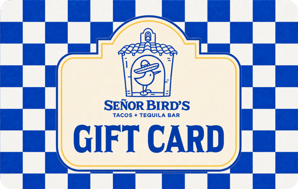
For Señor Bird’s, I have continued supporting menus and branded materials in a distinct blue-and-gold system. The visual language changed with the restaurant; the dependable thinking, communication and execution behind it stayed consistent.
WHAT THIS PROJECT DEMONSTRATES
Creative range guided by
a system,
not by sameness.
El Paso demonstrates my ability to combine information design, original photography, campaign thinking and environmental applications into a cohesive guest experience. It also shows how I adapt one clear idea for different audiences, formats and moments of use without overwhelming the message.