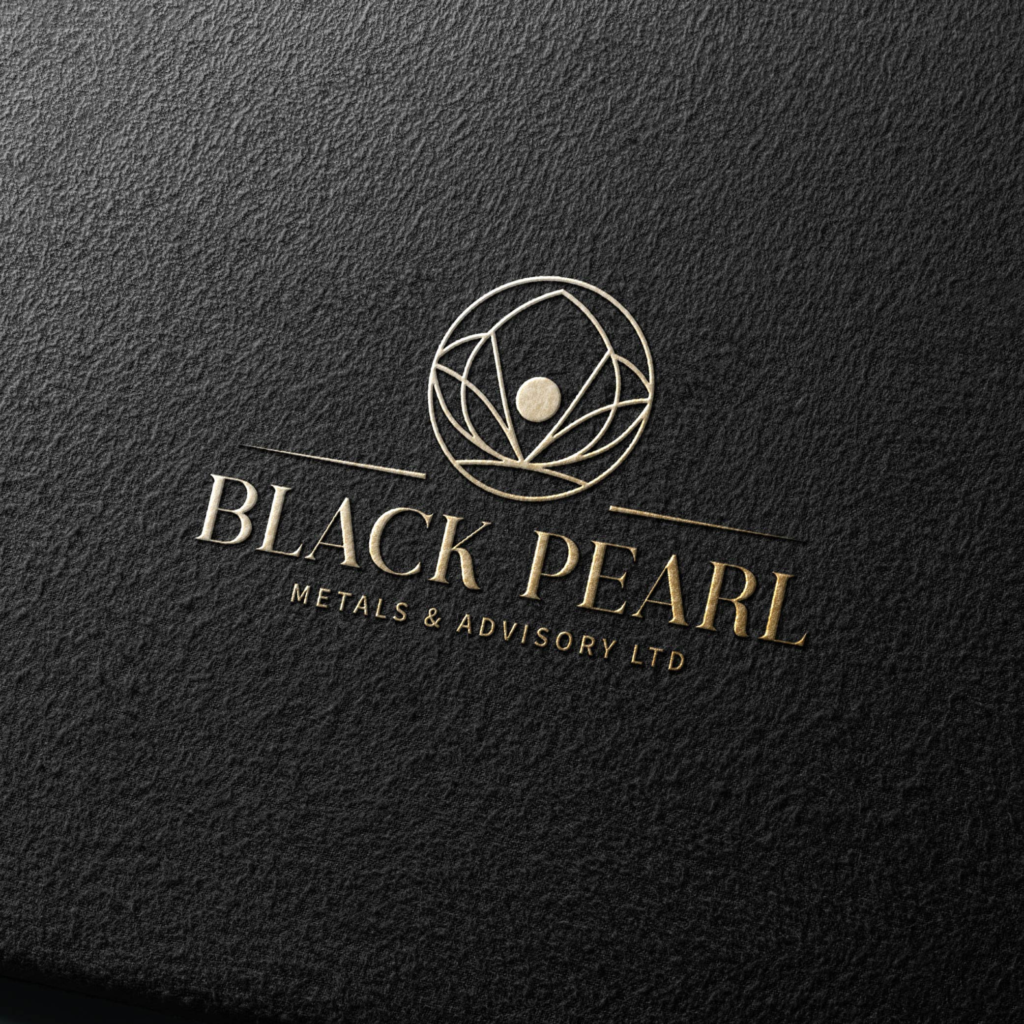
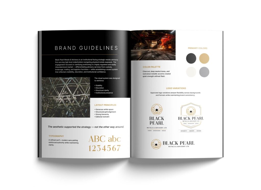
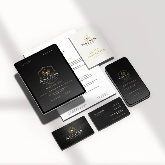
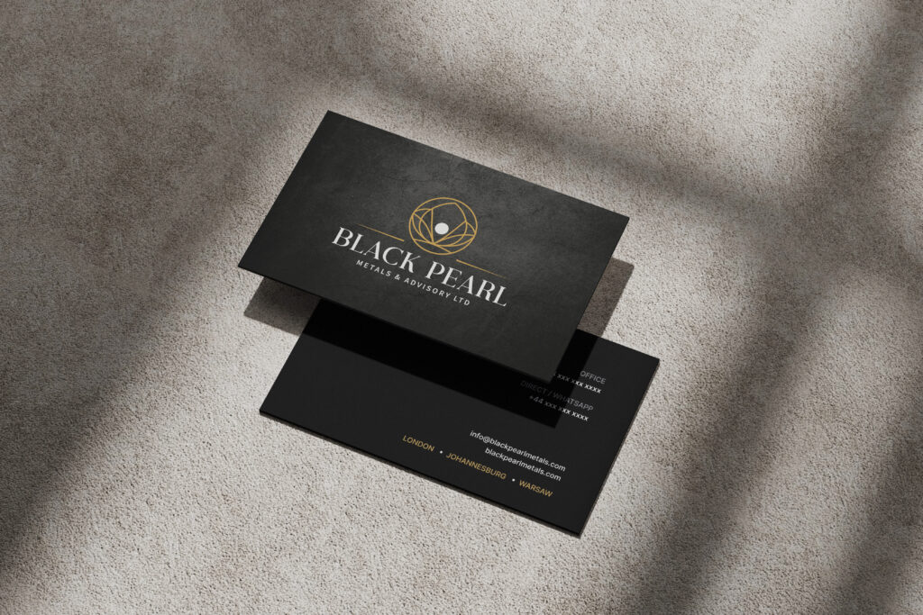
BLACK PEARL METALS & ADVISORY A trust-driven identity system designed to communicate precision, credibility, and authority. Black Pearl required more than a visual identity. The experience needed to feel established, strategic, and grounded from the very first interaction. CONTEXT Authority is built through perception. In high-trust industries, clarity matters more than noise. The visual system needed to communicate: confidence, professionalism, structure & discretion without relying on excess or trend-driven styling. STRATEGIC DIRECTION Designing for credibility first. The identity system focused on: restraint, hierarchy, precision, typography, intentional spacing & controlled contrast. Every element was designed to reinforce trust and consistency across both print and digital touch-points. EXPERIENCE SYSTEM Consistency creates confidence. The system extended across: presentation materials, digital interfaces, stationery, documentation and branded communication assets. The goal was to ensure every interaction reinforced the same level of professionalism and clarity. OUTCOME Restraint became the differentiator. Rather than competing visually, the brand establishes confidence through clarity, structure, and consistency. The result is an experience that feels refined, credible, and built for long-term positioning. Authority doesn’t need to be loud. It needs to be clear.