An earthy-luxury identity designed to make handcrafted jewelry feel as valuable as the care behind it.
CLIENT
Bijou Verde Jewelry
role
Brand & experience creative lead
industry
Jewelry
scope
Logo System • Collateral • Packaging
THE OPPORTUNITY
Handmade by nature.
Elevated by design.
Bijou Verde Jewelry was created by JoRea, whose boho-inspired pieces are crafted by hand. The visual identity needed to feel equally personal, elegant and minimal, but never generic or cheaply produced.
The challenge was to translate the organic character of her jewelry into a refined brand presence that could elevate every inetraction, from the first impression to the final unboxing.
THE STRATEGIC IDEA
A product’s value is
defined by its presence.
Designed for the moment of use
High-contrast typography creates refinement without relying on predictable jewelry-brand cliches.
Confidence in motion
Deep green, warm copper and botanical line- work connect luxury with the natural world.
Built to expand
Every element has purpose, allowing the craftsmanship and product experience to lead.
the identity
Botanical structure.
Editorial restraint.
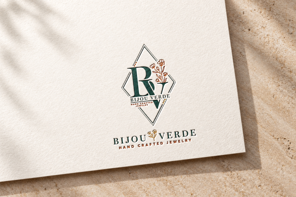
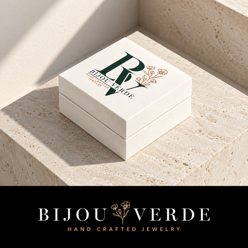
A sculptural BV monogram is framed by a geometric diamond and softened with hand-drawn botanicals. The primary wordmark gives the system a quieter horizontal expression for packaging and retail applications.
PACKAGING EXPERIENCE
Designed to
make the reveal
feel special.
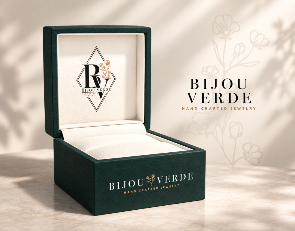
The jewelry box extends the identity into a tactile keepsake. Deep forest green creates visual weight, while the warm floral details and spacious cream interior create a refined stage for each handcrafted piece.
PACKAGING DIRECTION
A complete presence
beyond the product.
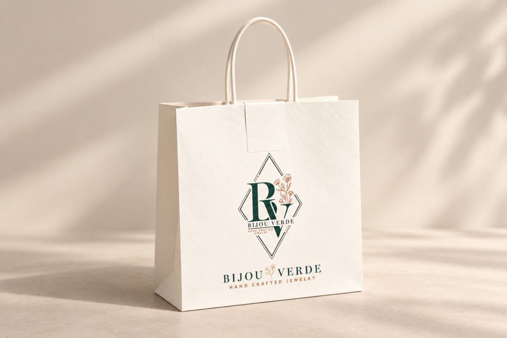
Shopping bags carry the monogram and wordmark into the customer experience, creating a cohesive sense of value before, during and after the purchase.
PERSONAL INTRODUCTION
Made by hand.
Presented with
intention.
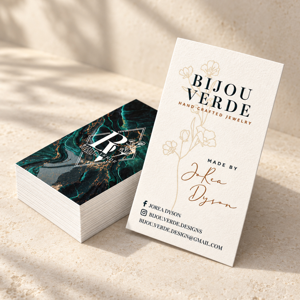
The business cards balance JoRea’s personal signature with the polished brand system, pairing a clean cream layout with a richer marbled expression of the identity.
BRAND STORYTELLING
A quiet system with
room for the work.
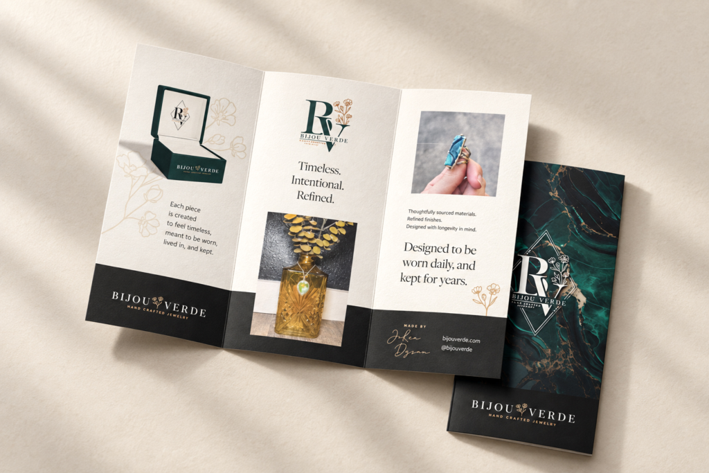
Supporting collateral uses generous space, editorial type and product imagery to communicate the same promise: thoughtful materials, refined finishes and jewelry designed to be worn, lived in and kept.
OUTCOME
Presence that
honors the product.
Bijou Verde emerged as an elegant, earthy-minimal identity that reflects both JoRea’s personal style and the handmade nature of her jewelry.
Across the logo, business cards, shopping bags and jewelry packaging, the system creates a complete experience that feels intentional, distinctive and worthy of the work inside.