An RN-founded med-spa identity shaped to feel modern, memorable and ready to grow from a rented treatment room into a complete destination.
CLIENT
Just Peachie Wellness
role
Brand Identity • Website Design
industry
Medical Aesthetics
scope
Logo System • Collateral • Signage & Campaign
THE OPPORTUNITY
A clinical vision
with room to grow.
After graduating as a registered nurse, Destiny began building a medical aesthetics practice offering injectables, weight-loss options and personalized beauty-enhancement consultations.
She approached me while renting a room inside another studio. The immediate need was a polished identity; the larger opportunity was to create a brand flexible enough to move with her into a permanent location, a website and ongoing local marketing.
THE STRATEGIC IDEA
Beauty made personal.
Expertise made visible.
Designed for trust
Balance the confidence of an RN-led practice with a warm, approachable beauty experience.
Created to be remembered
Build the identity around one distinctive emblem rather than familiar med spa cliches.
Ready to expand
Create a system that could move naturally from business cards and booking screens to permanent signage.
SYMBOL & STORY
A symbolic emblem
Destiny made her own.
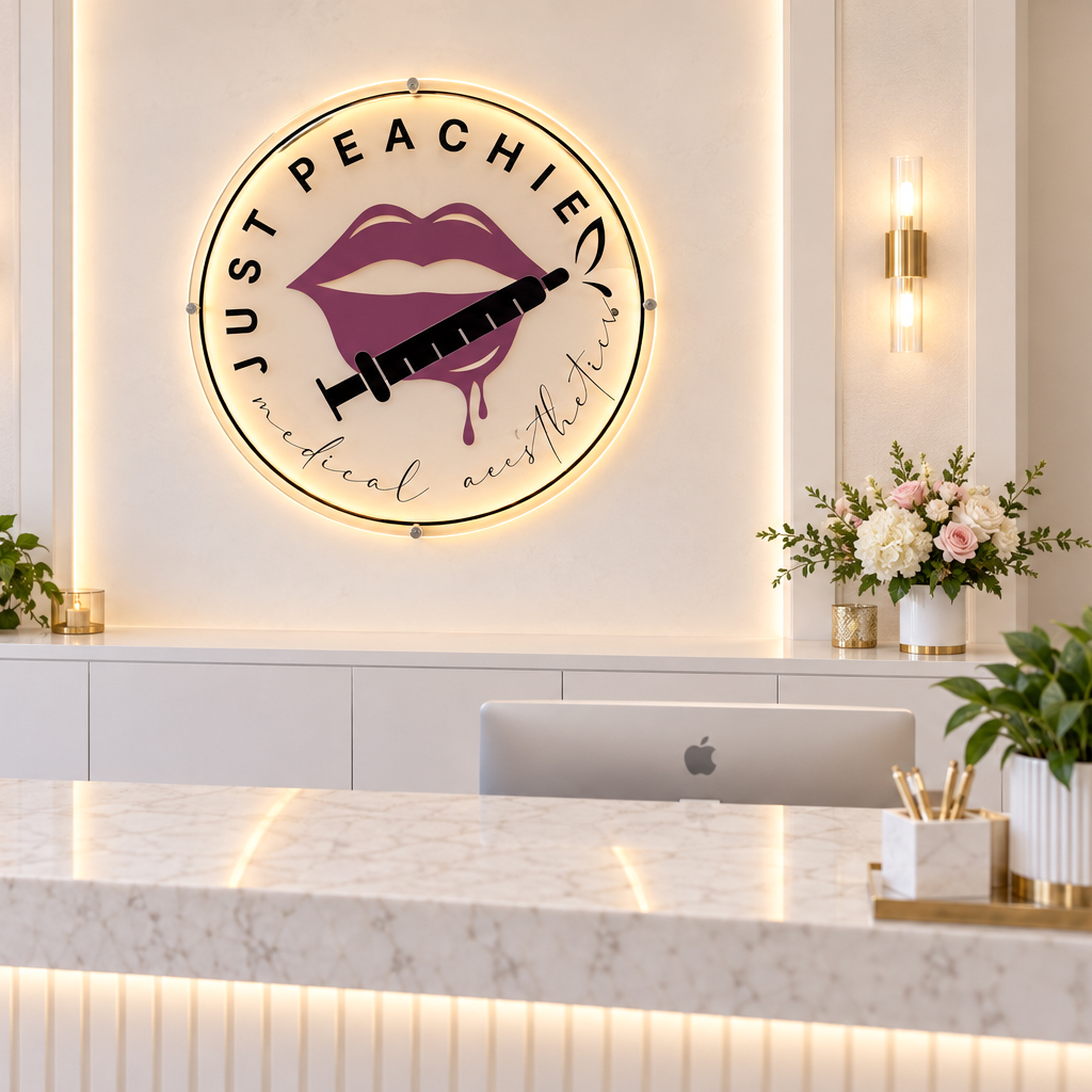
The peach-and-needle emblem was Destiny’s favorite emblem from the beginning. It brought her services, personality and chosen brand name together in one memorable mark; feminine energy without feeling delicate and iconic without becoming generic.
As the business grew, that emblem became more than a logo. It was fabricated as a glowing indoor sign for the lobby, turning the brand’s most meaningful symbol into a physical part of the client experience.
IDENTITY IN PRACTICE
Classic structure.
Personal energy.
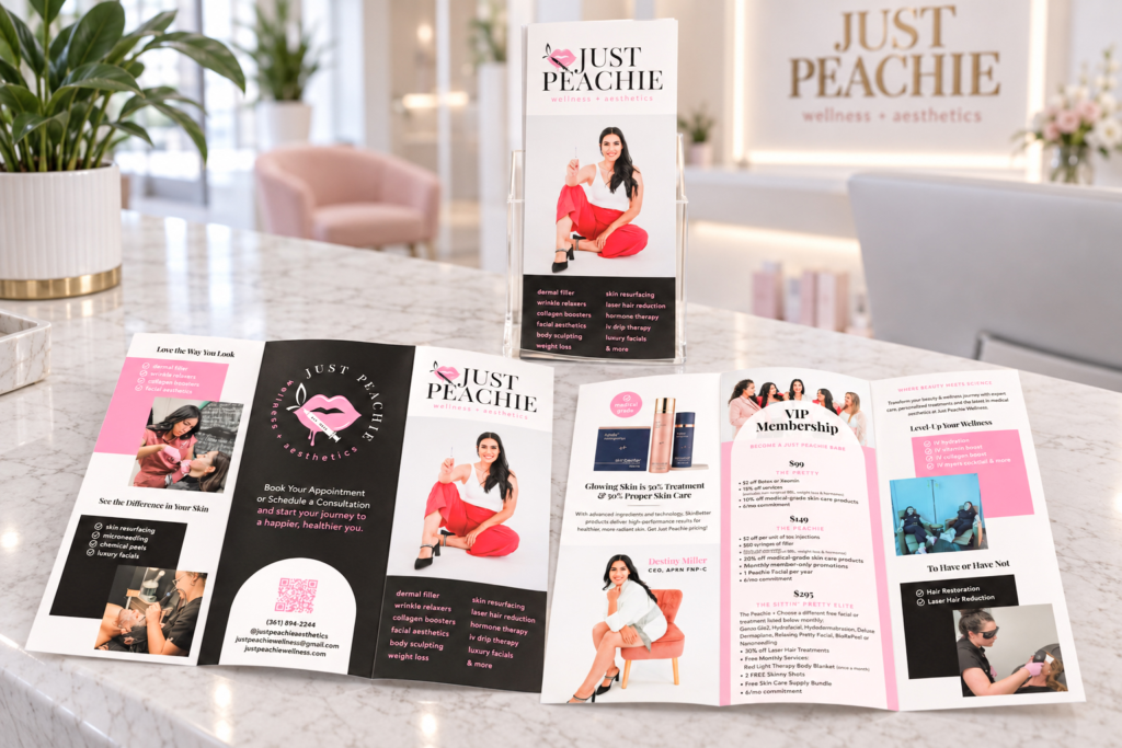
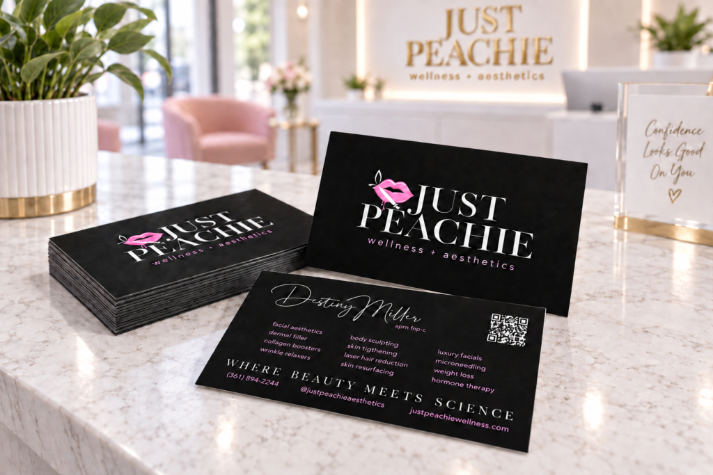
A refined serif word mark gave the young business credibility, while a cursive secondary style added warmth and personality. Pink and black, Destiny’s favorite colors, became a confident palette that could feel both modern and distinctly hers.
WEBSITE & BOOKING
A digital home
designed to
inform & convert.
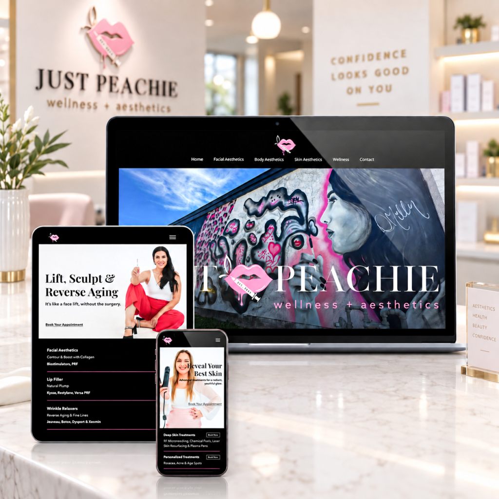
The full med-spa website organized Destiny’s services, supported consultations and gave clients a clear path to book appointments. The responsive design carried the brand consistently across desktop and mobile while leaving room for new offerings as the studio evolved.
ENVIRONMENTAL BRANDING
From a favorite symbol to
a real
world landmark.
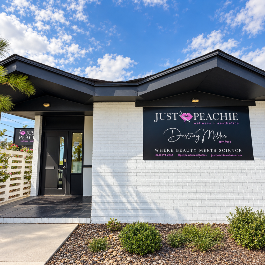
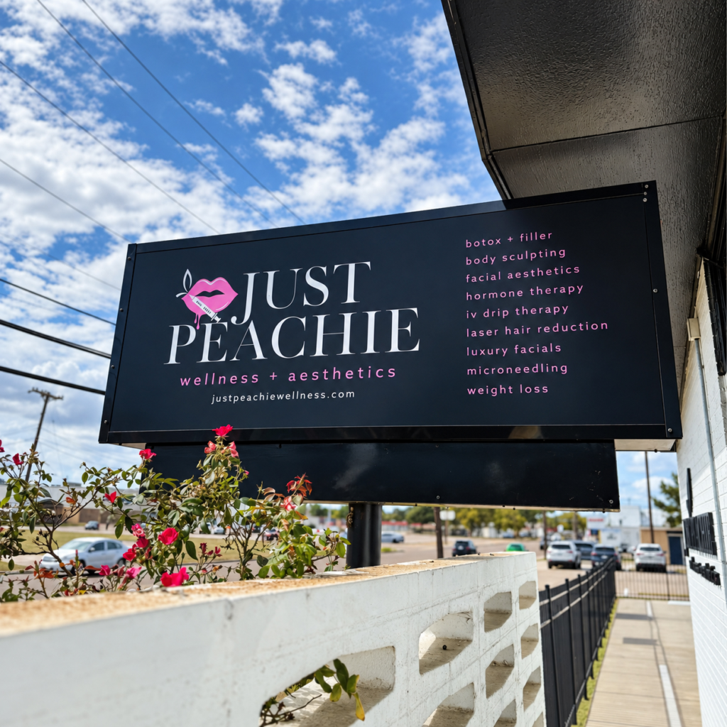
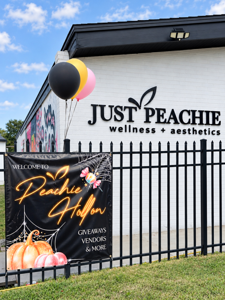
When Destiny purchased her own building, I translated the identity into production-ready signage for the exterior, lobby and building frontage.
The illuminated emblem created a memorable welcome indoors, while the exterior signs made the growing med-spa recognizable from the street; day or night.
A BRAND BROUGHT TO LIFE
One visual language across
every client touch-point.
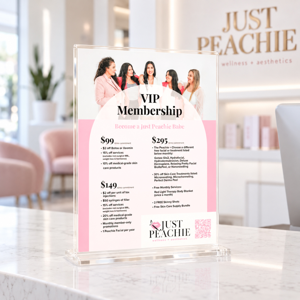
From the front of the building to the booking experience and marketing materials, every application reinforced the same balance of clinical confidence, modern femininity and local personality.
LAUNCH CAMPAIGN
A grand opening
with a little
seasonal magic.
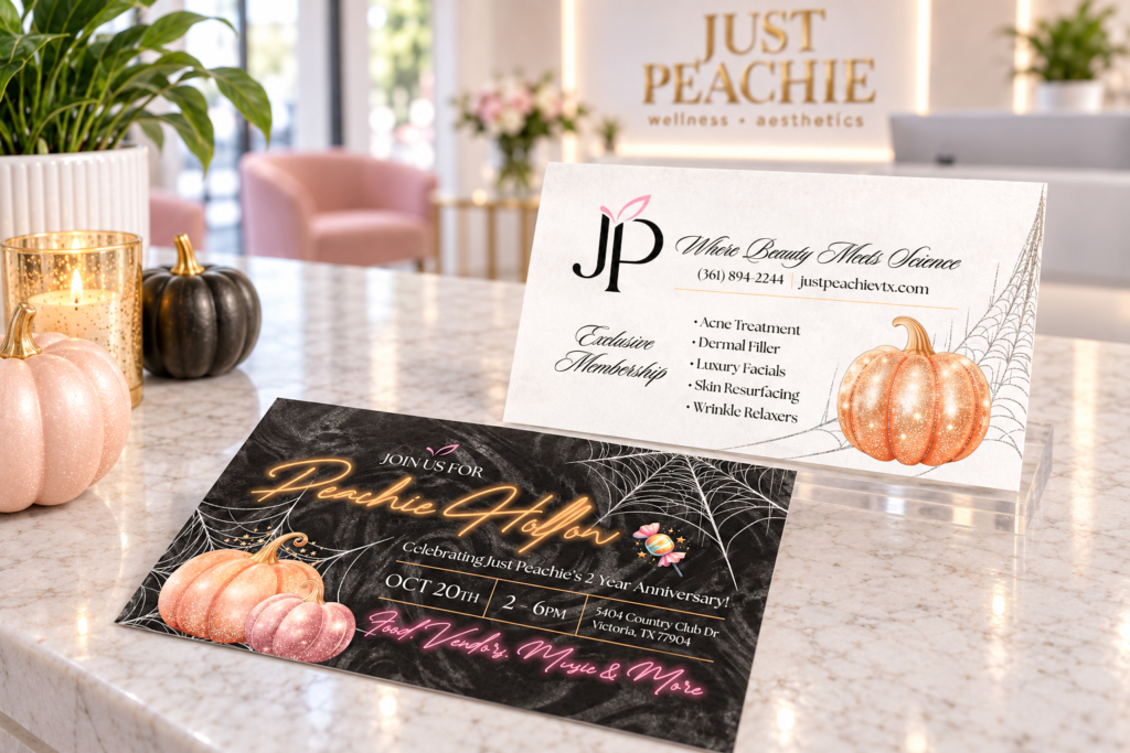
For the Halloween grand opening, I extended the identity into “Peachie Hollow”, a playful campaign expressed through custom signs and social media advertising without losing the established brand voice.
OUTCOME
Built to grow
beyond the first room.
What began as an identity for a nurse injector became a cohesive physical and digital presence for a complete local med-spa; anchored by one meaningful emblem that clients could recognize everywhere.