

Black Pearl Metals & Advisory
Institutional Metals Advisory
Positioning, Messaging Architecture & Brand System
OVERVIEW
Black Pearl Metals & Advisory is an institutional facing strategic metals advisory firm serving high level stakeholders navigating physical metals exposure. The engagement focused on clarifying positioning in a highly regulated and easily misunderstood market — differentiating advisory services from custody, brokerage, trading, and logistics functions — while establishing a brand system that reflected credibility, discretion, and institutional confidence.
01. The Challenge
The firm operated in a space where terminology blurs quickly. Advisory, brokerage, custody, trading, and logistics services often overlap in perception — even when legally and operationally distinct. Internally, the team understood their role clearly.
Externally, the messaging risked:
- Being misinterpreted as transactional rather than advisory
- Blending into commodity brokerage competitors
- Appearing conceptual rather than institutional
- Lacking defined service boundaries
The brand needed to signal restraint, intelligence, and structure — not salesmanship.
Through structured conversations and competitive review, several patterns emerged:
- Competitors relied heavily on transactional language
- Institutional audiences responded to clarity and defined scope
- The firm’s strength was advisory positioning — not execution services
- Language needed to reflect precision and boundaries
The brand needed to signal restraint, intelligence, and structure — not salesmanship.
02. Discovery & Insight
03. Strategic Framework
Positioning Statement
Black Pearl provides advisory-only strategic metals consulting for institutional stakeholders — without custody, brokerage, trading, or logistics execution.
This distinction became the anchor.
Messaging Architecture
Three core pillars guided all communications:
1. Advisory Authority
Strategic insight over transactional execution.
2. Defined Boundaries
Clear articulation of what the firm does —
and does not do.
3. Institutional Restraint
Measured tone, precise language, minimalistic
presentation.
“What We Are / What We Are Not”
This became a critical structural element in both website and pitch materials.
We Are:
• Strategic advisors
• Institutional consultants
• Risk-aligned partners
We Are Not:
• Broker-dealers
• Custodians
• Traders
• Logistics providers
This boundary slide strengthened credibility immediately.
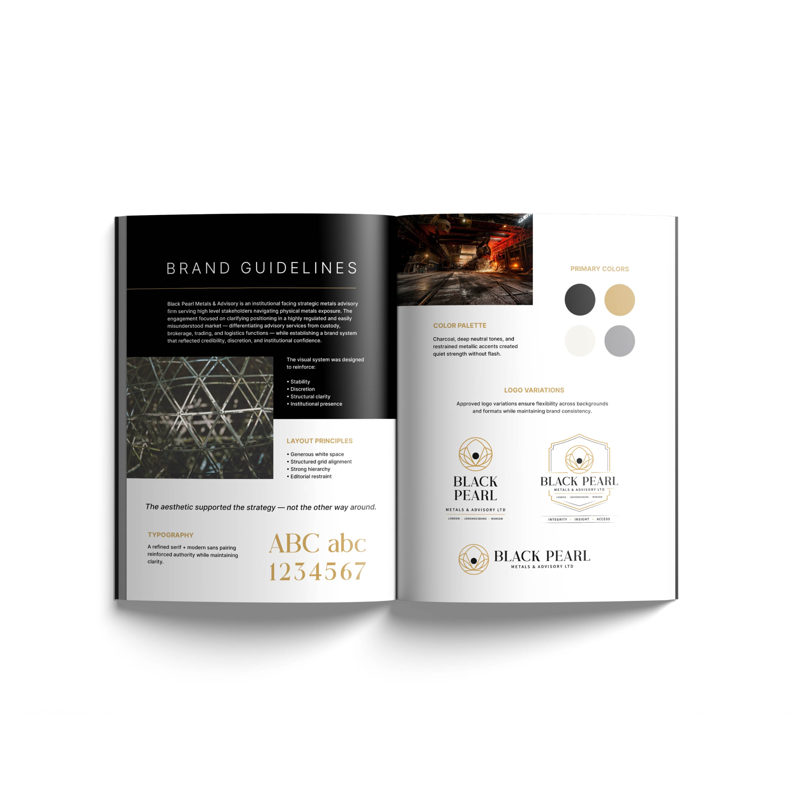
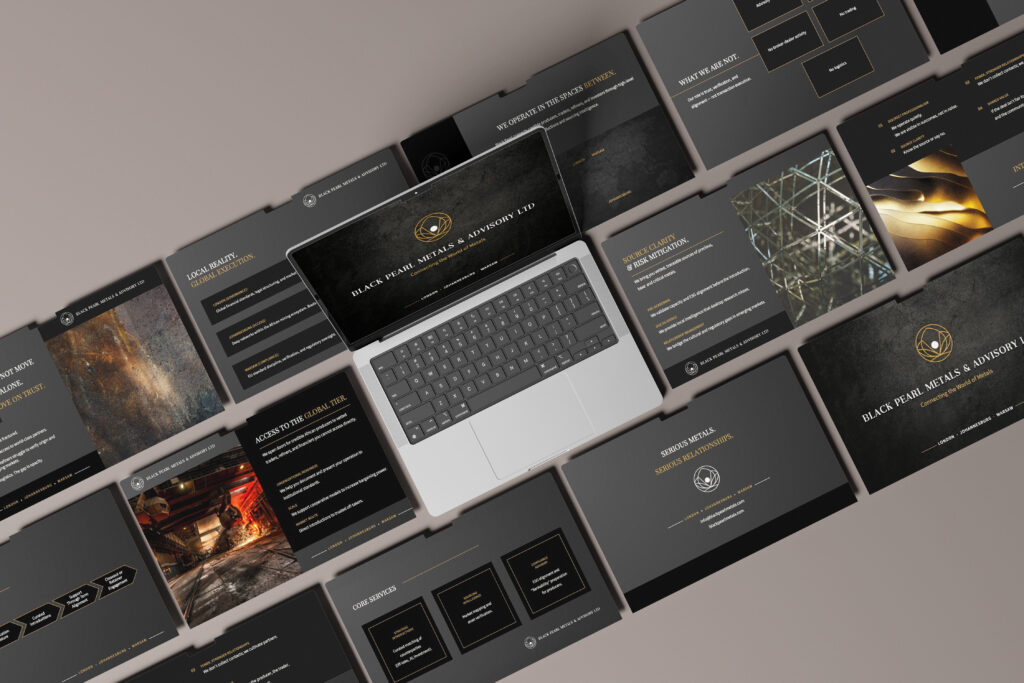
04. Brand & Visual System
The visual system was designed to reinforce:
- Stability
- Discretion
- Structural clarity
- Institutional presence
The aesthetic supported the strategy — not the other way around.
Typography
A refined serif + modern sans pairing reinforced
authority while maintaining clarity.
color palette
Charcoal, deep neutral tones, and restrained metallic accents created quiet strength without flash.
layout principles
Every layout decision reinforced performance without sacrificing clarity.
The aesthetic didn’t decorate the strategy — it expressed it.
- Generous white space
- Structured grid alignment
- Strong hierarchy
- Editorial restraint
05. Strategic Artifacts
Deliverables included:
- Positioning framework documentation
- Messaging hierarchy guide
- “What We Are / What We Are Not” boundary slide
- Brand guideline system
- Refined pitch deck with institutional alignment
Each asset reinforced advisory clarity.
06. Impact & Alignment
The result was a sharper, more confident market presence.
The firm moved from conceptual positioning to defined
institutional clarity.
Stakeholder conversations became more direct.
Messaging felt measured rather than exploratory.
Internal alignment strengthened around advisory identity.
The brand now communicates structure before aesthetics
— authority before promotion.
07. Reflection
In institutional markets, volume does not equal strength.
Clarity does.
This engagement reinforced that the most powerful brand work often happens in restraint — in defining edges, not expanding noise.