

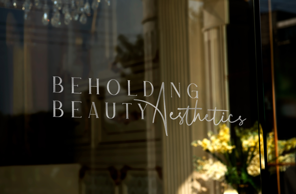
Beholding Beauty Aesthetics
Medical Aesthetics Studio
Brand Positioning, Identity System & Digital Experience
OVERVIEW
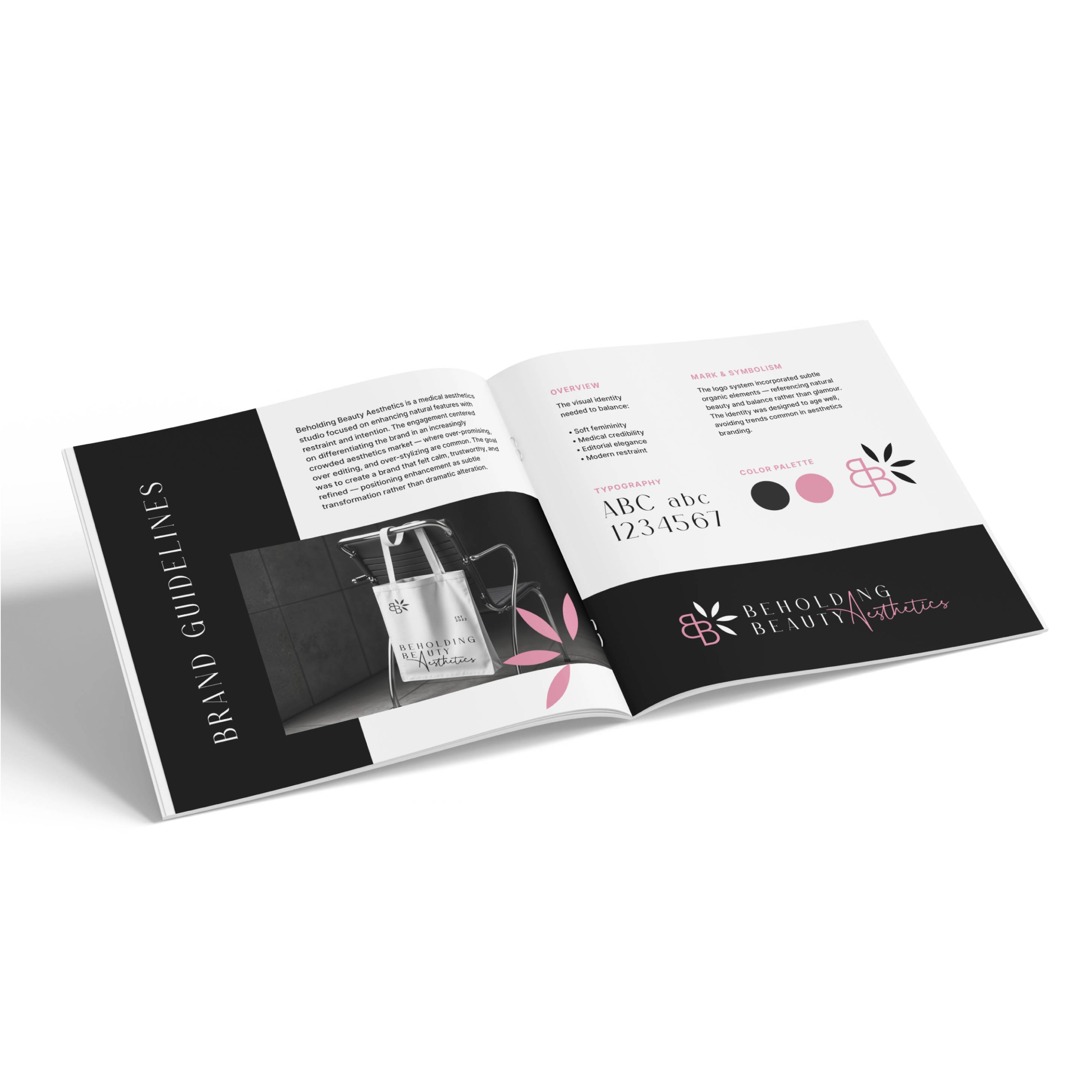
Beholding Beauty Aesthetics is a medical aesthetics studio focused on enhancing natural features with restraint and intention. The engagement centered on differentiating the brand in an increasingly crowded aesthetics market — where over-promising, over editing, and over-stylizing are common. The goal was to create a brand that felt calm, trustworthy, and refined — positioning enhancement as subtle transformation rather than dramatic alteration.
01. The Challenge
The aesthetics industry is saturated with:
- Glamour-forward branding
- Trend-driven visuals
- Heavy filters and exaggerated results
- Sales-driven messaging
For a practitioner focused on natural results and
client confidence, this environment creates tension.
Beholding Beauty needed to:
- Attract clients seeking subtle enhancement
- Communicate professionalism and medical credibility
- Avoid blending into overly “Instagram” aesthetics brands
- Establish trust before promotion
The brand required emotional intelligence as much as visual polish.
Through brand conversations and audience clarification,
several insights emerged:
- Clients were seeking confidence, not transformation
- The practitioner valued education over persuasion
- Trust and discretion were primary decision drivers
- Many competitors leaned heavily into trends
The core strategic insight:
In aesthetics, restraint communicates expertise.
Rather than promising dramatic change, the brand would
emphasize enhancement, balance, and refinement.
02. Discovery & Insight
03. Strategic Framework
Positioning Statement
Beholding Beauty Aesthetics provides refined, medically informed treatments designed to enhance — not alter — natural beauty.
BRAND PILLARS
1. Subtle Enhancement
Results that feel aligned,
not exaggerated.
2. Education & Transparency
Clear communication over sales
language.
3. Professional Trust
Medical credibility paired with
warmth.
audience definition
Primary:
Women seeking natural, confidence-
building aesthetic treatments.
Secondary:
Clients transitioning from trend-driven
providers to long-term trusted care.
Voice & Tone Principles
- Calm and reassuring
- Professional without being clinical
- Elevated without being exclusive
- Honest over aspirational
This tone guided every design and messaging decision.
04. Brand & Visual System
The visual identity needed to balance:
- Soft femininity
- Medical credibility
- Editorial elegance
- Modern restraint
Typography
A refined serif paired withclean sans typography created warmth anchored by structure.
color palette
Muted blush tones, neutrals, and controlled contrast supported calm sophistication.
mark & symbolism
The logo system incorporated subtle organic elements — referencing natural beauty and balance rather than glamour. The identity was designed to age well, avoiding trends common in aesthetics branding.
05. Brand Touchpoints & Implementation
Deliverables included:
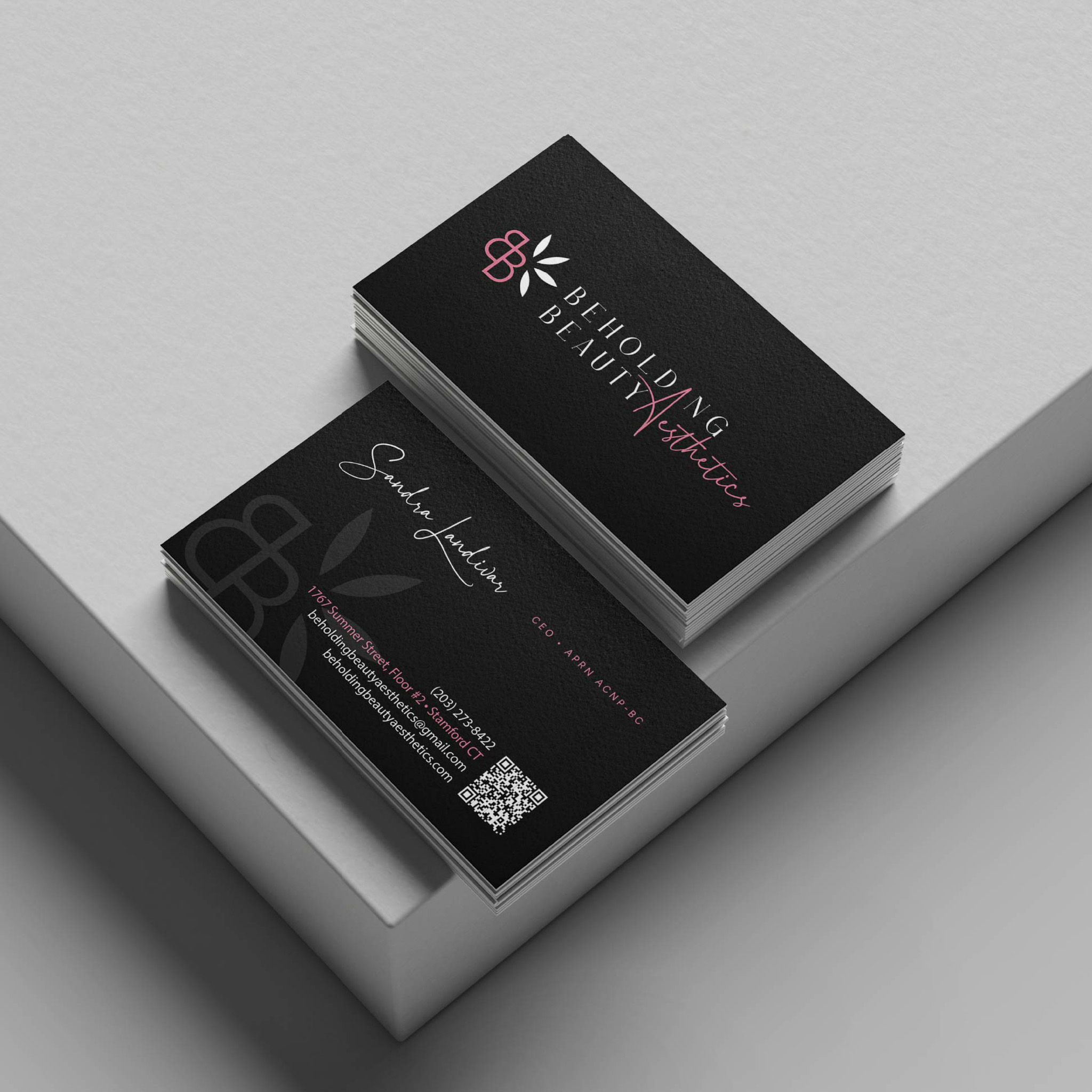
- Logo system & variations
- Typography & color guidelines
- Business collateral
- Social media direction
- Brand photography guidance
Each touchpoint reinforced the central idea of
enhancement through restraint.
06. Impact & Alignment
Beholding Beauty launched with a differentiated presence in a competitive market. Rather than competing through glamour, the brand positioned itself as measured and credible.
The result:
- Increased perceived professionalism
- Clear differentiation from trend-heavy competitors
- Stronger alignment between practitioner values and brand voice
Clients experienced consistency from first impression through consultation.
07. Reflection
In industries driven by visual transformation, subtlety becomes the boldest move.
This engagement reinforced that emotional alignment — not trend adoption — creates longevity.
Enhancement, not exaggeration, became the strategy.