
Full Swing Hydration
Performance Hydration Brand
Positioning, Brand Architecture & Campaign Direction
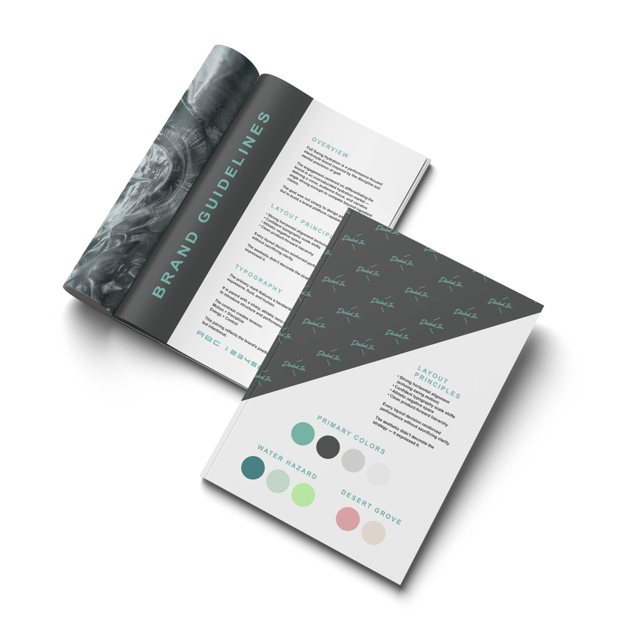
OVERVIEW
Full Swing Hydration is a performance-focused electrolyte brand inspired by the discipline and mental precision of golf.
The engagement centered on differentiating the brand in an oversaturated hydration market — defining a voice, audience focus, and narrative angle strong enough to compete beyond ingredient claims.
The goal was not simply to design packaging — but to build a brand platform capable of expansion.
01. The Challenge
The hydration category is crowded with loud claims:
- “More electrolytes.”
- “Cleaner ingredients.”
- “Better performance.”
Functionally, most products promise similar outcomes.
The risk for Full Swing Hydration was blending into a sea of high-energy, gym-dominant, neon-coded competitors.
The brand needed:
- A defined audience
- A distinct personality
- A positioning angle beyond ingredients
- A scalable narrative platform
This was not about hydration. It was about identity.
Through discovery conversations and competitive review,
several patterns became clear:
- Most hydration brands target high-intensity athletes
- Few brands focus on mental clarity and precision
- Golf culture blends discipline, performance, and lifestyle
- The audience values refinement over chaos
The insight:
- Hydration could be positioned around precision — not intensity.
- Rather than “extreme performance,” the brand could own:
- Composure. Focus. Dialed-in energy.
- That strategic shift opened differentiation.
02. Discovery & Insight
03. Strategic Framework
Positioning Statement
Full Swing Hydration fuels disciplined performance — built for athletes who value precision as much as power.
brand pillars
1. Precision Over Hype
Controlled energy. Measured tone.
Refined performance.
2. Discipline & Focus
Hydration that supports mental
clarity as much as physical output.
3. Elevated Athletic Identity
Golf-inspired without becoming
novelty. Sport-driven without being
aggressive.
audience definition
Primary:
Performance-driven golfers and recreational athletes seeking sustained clarity.
Secondary:
Lifestyle consumers drawn to refined
athletic branding.
Voice & Tone Principles
- Confident, not loud
- Competitive, not chaotic
- Elevated, not flashy
- Focused, not frantic
This tone direction informed all creative execution.
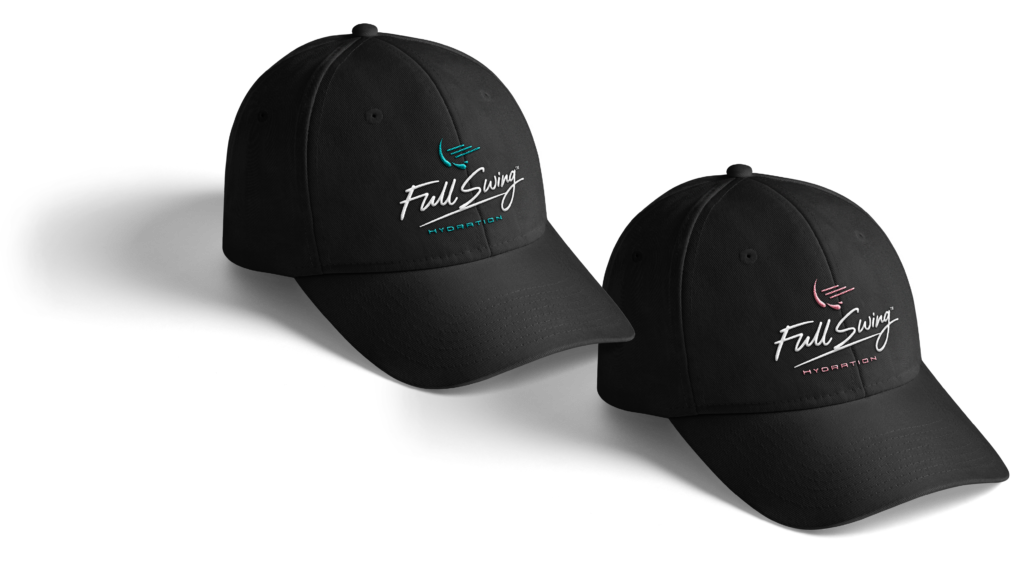
04. Brand & Visual System
The visual system was designed to balance performance energy with brand precision.
It needed to feel:
- Athletic
- Competitive
- Modern
- Retail-ready
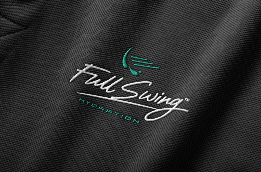
Typography
The primary mark features a handwritten script — expressive, fluid, and human.
It is paired with a sharp, athletic sans-serif typeface to introduce structure and performance credibility.
The contrast creates tension:
Motion + Discipline
Energy + Control
This pairing reflects the brand’s positioning — bold, but intentional.
color palette
The palette was built to stand out in a crowded hydration category without relying on noise.
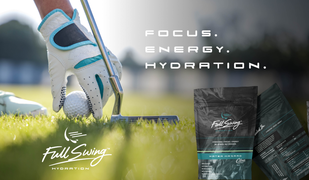
Deep charcoals and graphite tones anchor the system. Teal and mint introduce freshness and clarity. Flavor extensions (Citrus, Pink Grapefruit) expand the system while maintaining cohesion.
The result is high contrast with restraint — not chaos.
layout principles
Every layout decision reinforced performance without sacrificing clarity.
The aesthetic didn’t decorate the strategy — it expressed it.
- Strong horizontal alignment (echoing swing motion)
- Confident typography scale shifts
- Athletic negative space
- Clean product-forward hierarchy
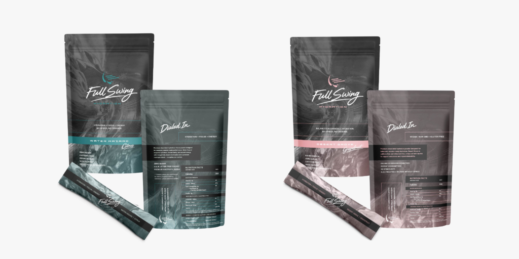
05. Packaging & Product Architecture
The packaging structure emphasized:
- Clear hierarchy
- Strong product name visibility
- Flavor differentiation through color
- Balanced negative space
Rather than overcrowding claims, the design leaned into restraint — allowing the brand personality to carry weight. This created premium perception within a performance category.
06. Digital & Campaign Direction
Campaign exploration centered around phrases like:
“Dialed In.”
“Precision Hydration.”
The messaging architecture ensured cohesion between
packaging, web, and social assets.
07. Strategic Artifacts
Deliverables included:
- Positioning framework
- Brand narrative documentation
- Messaging pillars
- Tone & voice guidelines
- Logo system & brand assets
- Packaging mockups
- Social media direction
- Launch graphics
Each asset reinforced the central idea of controlled performance.
08. Impact & Alignment
Full Swing Hydration emerged with a differentiated voice in a crowded market.
Rather than competing through volume, the brand positioned itself through clarity and identity.
The result was a cohesive brand system capable of expanding into new flavors,
campaign concepts, and retail environments without losing strategic consistency.
09. Reflection
In crowded categories, louder is rarely smarter.
This work reinforced a simple truth:
Differentiation often comes from narrowing focus — not expanding claims.
Precision shaped the positioning.
And the positioning shaped the brand.